

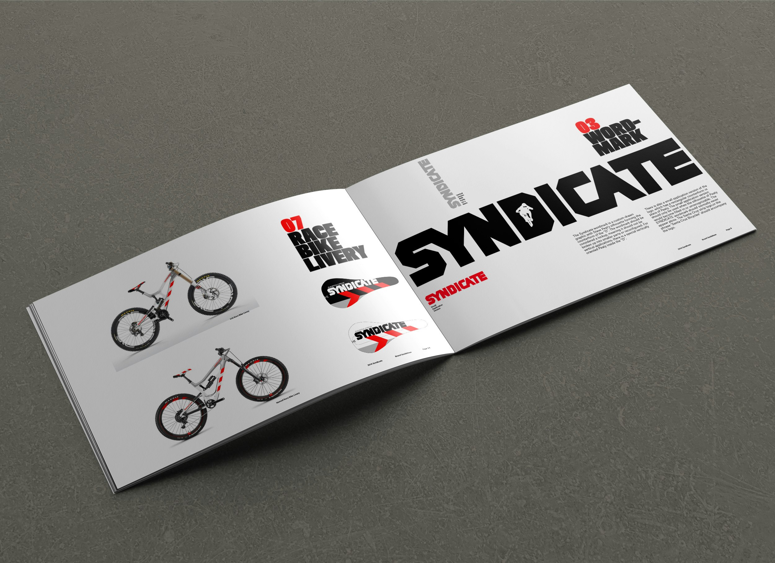

Syndicate brand ID ≥
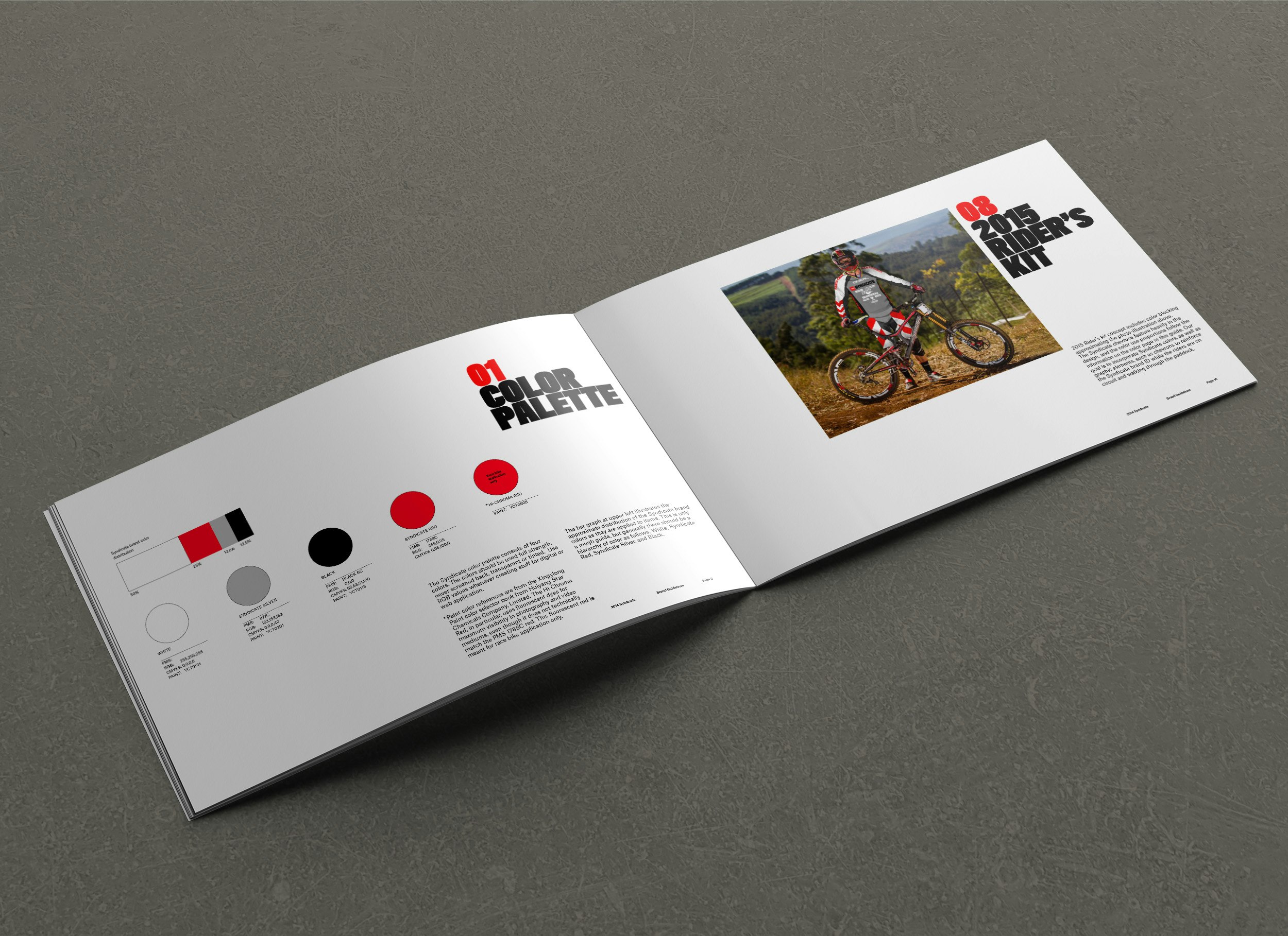
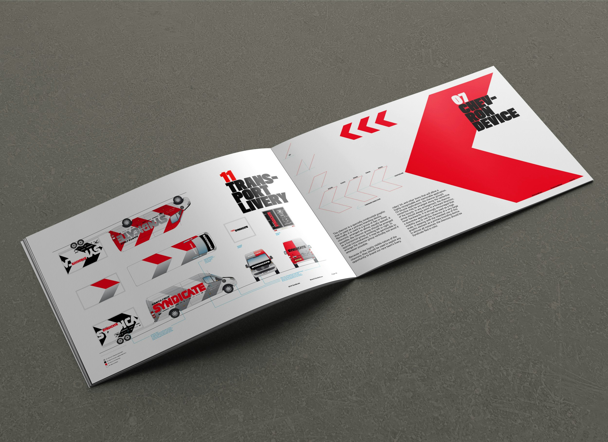
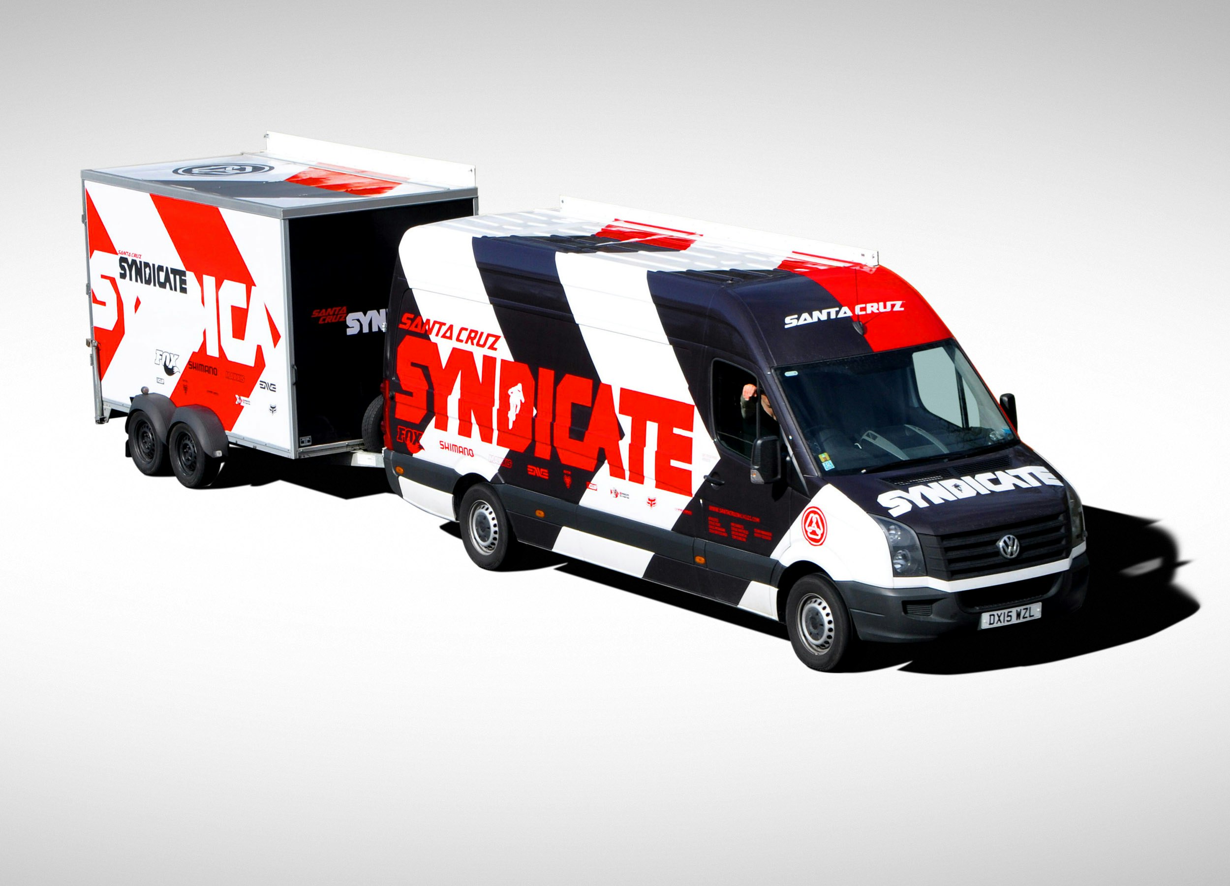
The Syndicate is Santa Cruz Bicycles' UCI Downhill racing team. I redesigned their brand ID concurrently with the Santa Cruz brand ID redesign and the Juliana brand ID refinement. I was busy. The chevron/diagonals were a feature that were derived from creating a bounding trapezoid around the letter "S" in the original 1994 Santa Cruz logo, and mirroring it to create a chevron. This graphic device was applied liberally to almost anything associated with the Syndicate: video titles, livery, marketing, riders' kit, tents, flags, you name it. My goal was to get the chevrons to be the dominant visual feature of the brand, so that in the near future, we could translate this graphic device over to the Santa Cruz brand identity.
In the mountain bike industry, there was a lot of visual similarity between the top brands, and I felt this device could be a powerful trademarkable visual element for the Syndicate and Santa Cruz to own.