

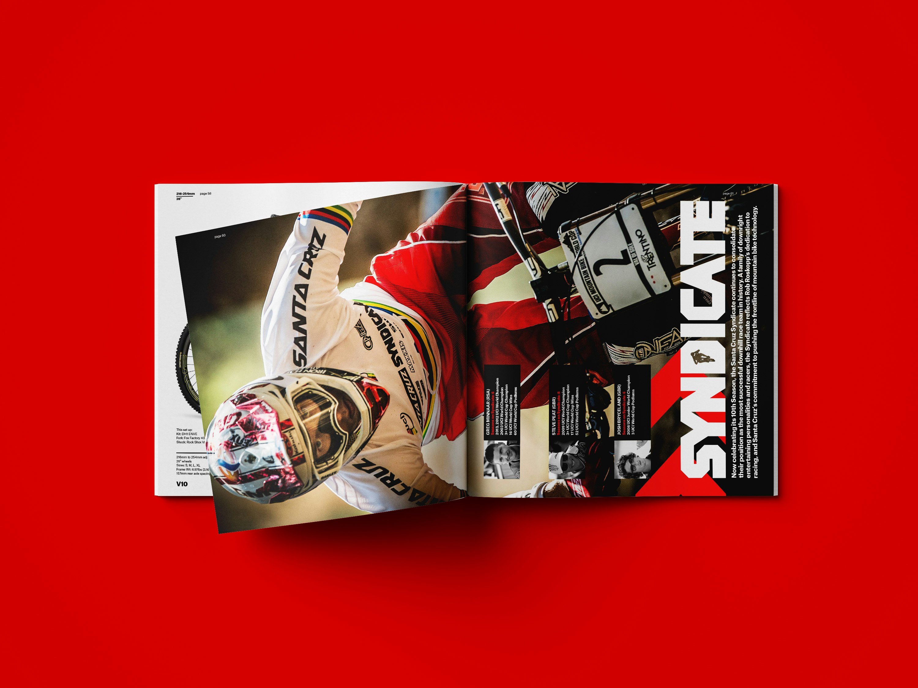
Santa Cruz brand ID ≥
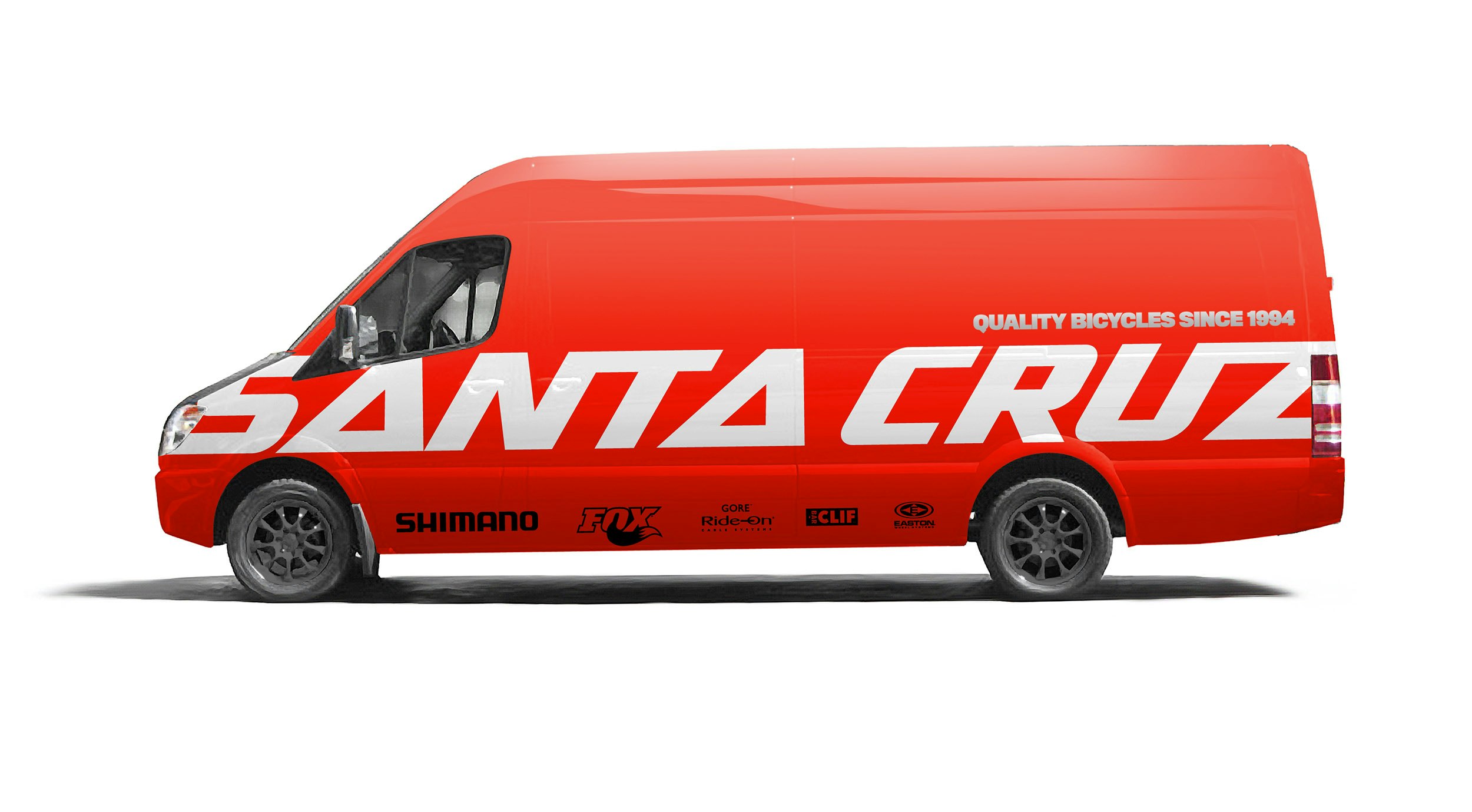
During my 3-1/2 year stint at Santa Cruz, I redesigned three of their brands: Santa Cruz Bicycles, Juliana Bicycles, and the Syndicate UCI Downhill team. Every touchpoint for Santa Cruz was redone: shipping boxes, retail packaging, website, videos/motion graphics, advertising/marketing, their new headquarters environmental graphics/signage, bike graphics, print/catalogs, softgoods, retail design/fixtures, social media, everything. It was a huge challenge, but also incredibly fun and satisfying. I upped their brand ID game so they could visually compete head to head with the really big brands: Specialized, Trek, Giant, etc.
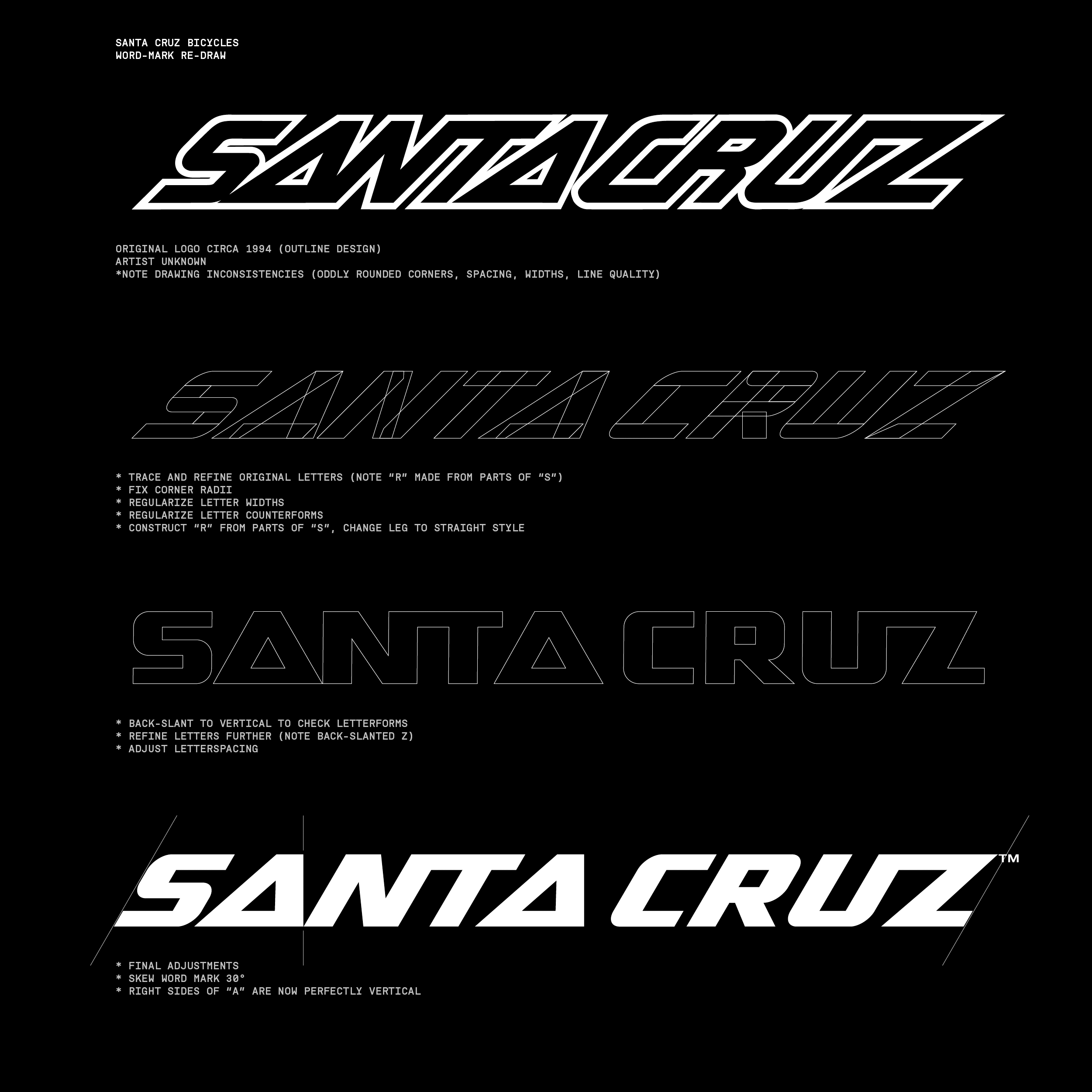
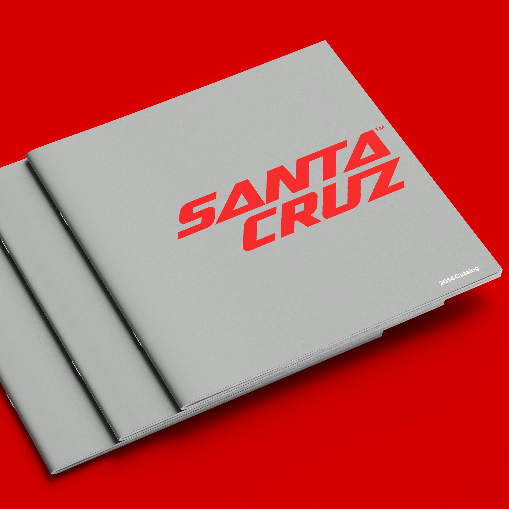
One of the biggest challenges for me was trying to bring up the standards of design without taking away their cred as a boutique mountain bike brand. Although many totally new versions of the Santa Cruz wordmark were created and evaluated, ultimately we decided that a reworked version of the original 1994 logo would be the appropriate solution. I worked with Marketing Director Will Ockelton and Rob Roskopp, founder and CEO, to create a brand new wordmark that no one noticed!! The main goal of the new wordmark was to fix the flaws of the original, but keep the overall visual style. It worked!! I can't recall ever seeing a single reference to rebrand or redesign since the changes were implemented in 2013. And believe me, Santa Cruz fans and loyalists would be the first to bitch about the brand selling out if they thought we were trying to up our brand ID game to look more pro.