
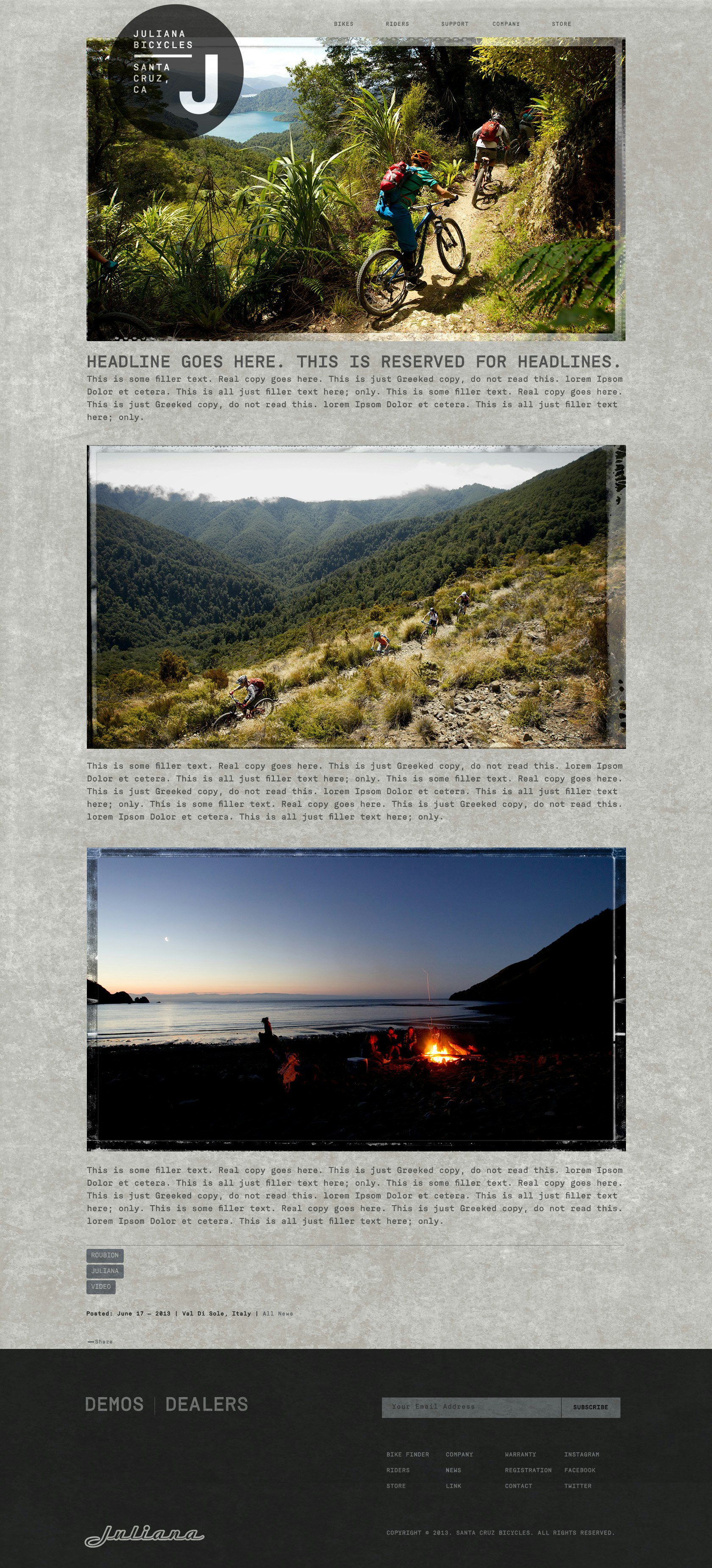

Juliana brand ID ≥
In an industry known to "shrink it and pink it", when it comes to creating women's-specific products, I wanted the Juliana Bicycle brand to have a visual identity that was as authentic as possible. After a somewhat rushed initial brand launch of the cycle line named after legendary cyclist Juli Furtado, I began to rethink the identity to reflect a more considered approach. The engineering basis for the Juliana line of bikes is Santa Cruz Bicycles' product line. Mid and high-spec models from Santa Cruz are slightly revised and branded as Juliana.
The idea of branding a Santa Cruz MTB for women is ridiculous to some, but the management at Santa Cruz Bicycles was serious about building a brand aimed at women of all levels of riding ability, and who wanted a highly capable bike with zero compromises. The brand was to be about community as much as competition.
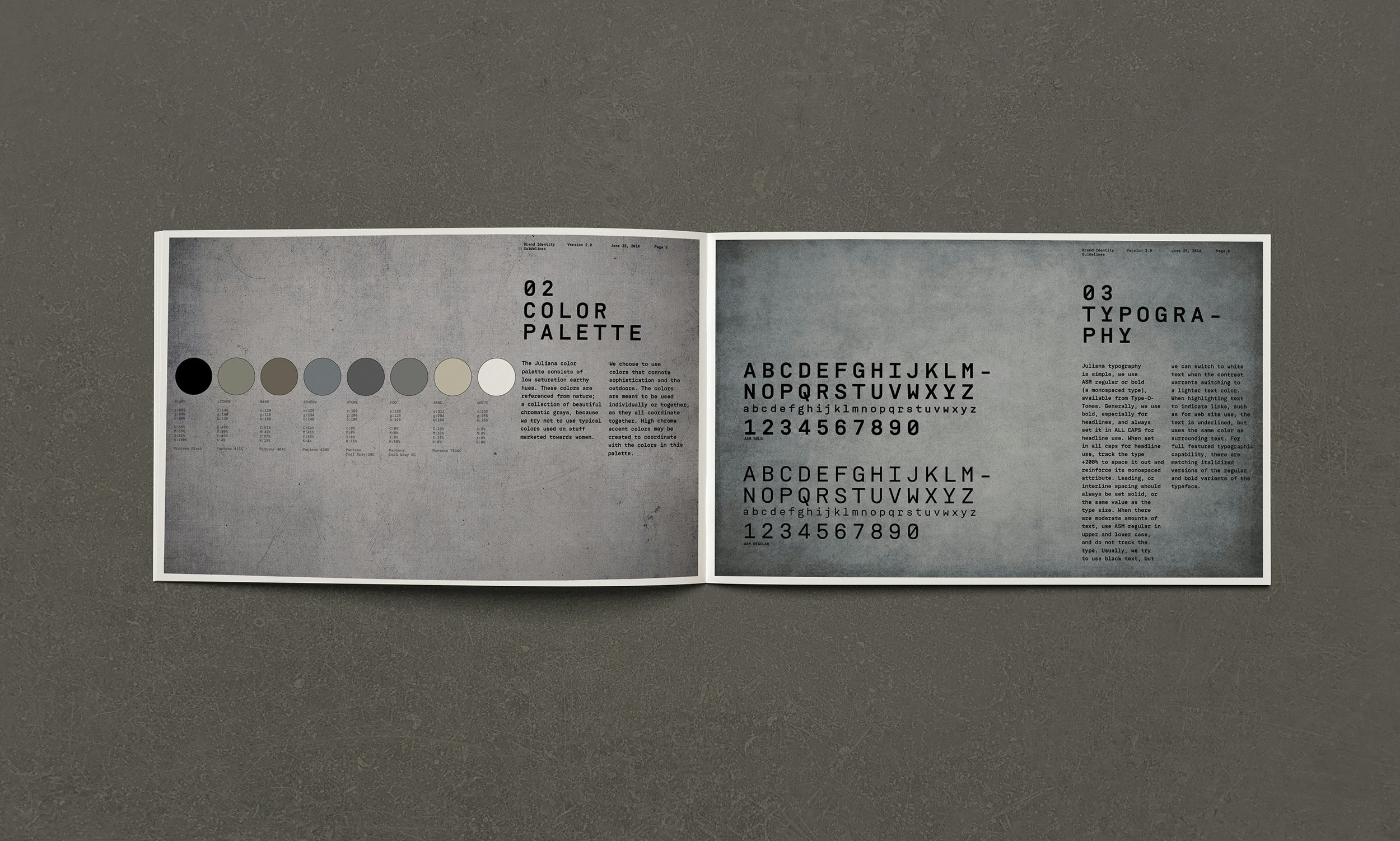
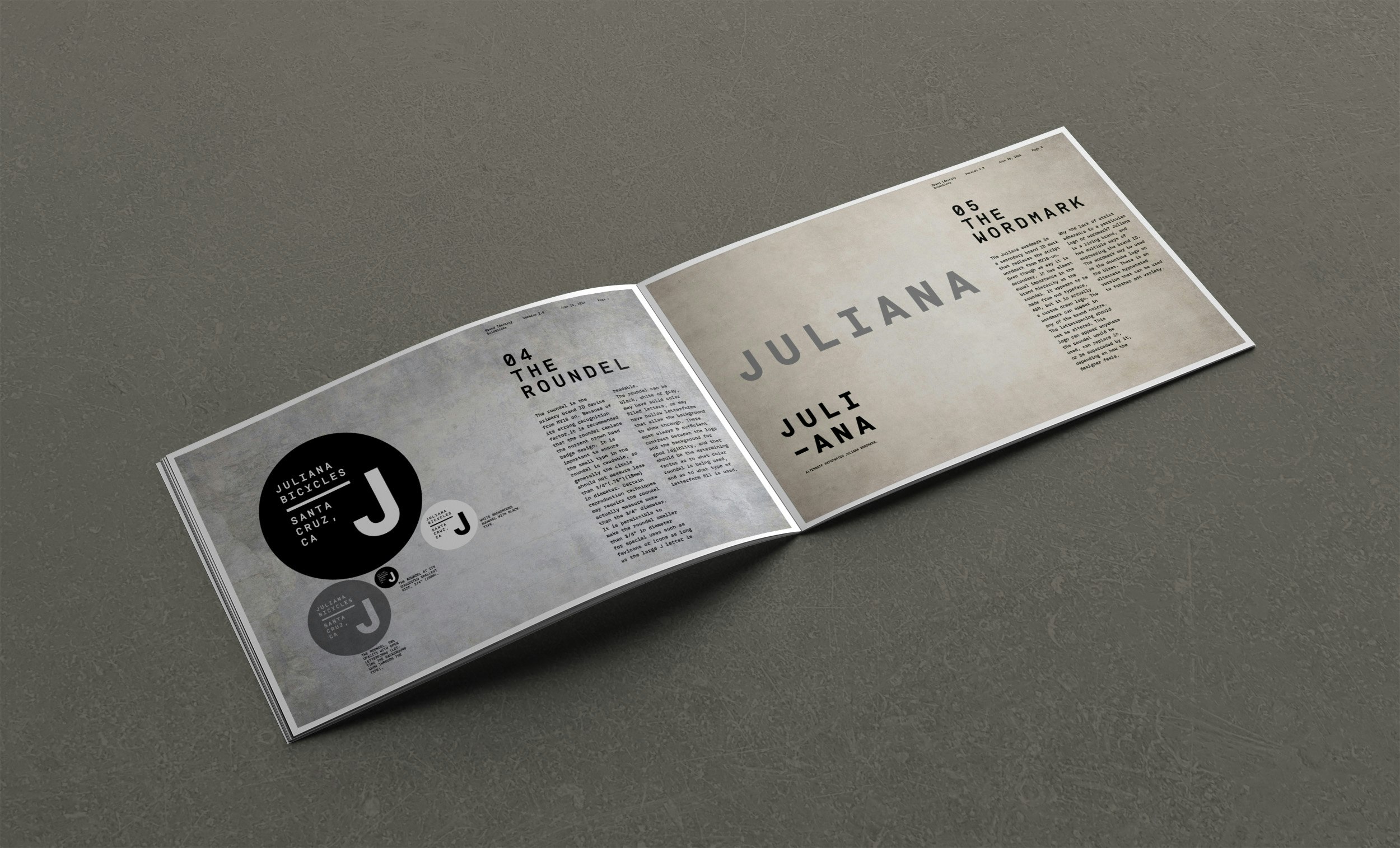
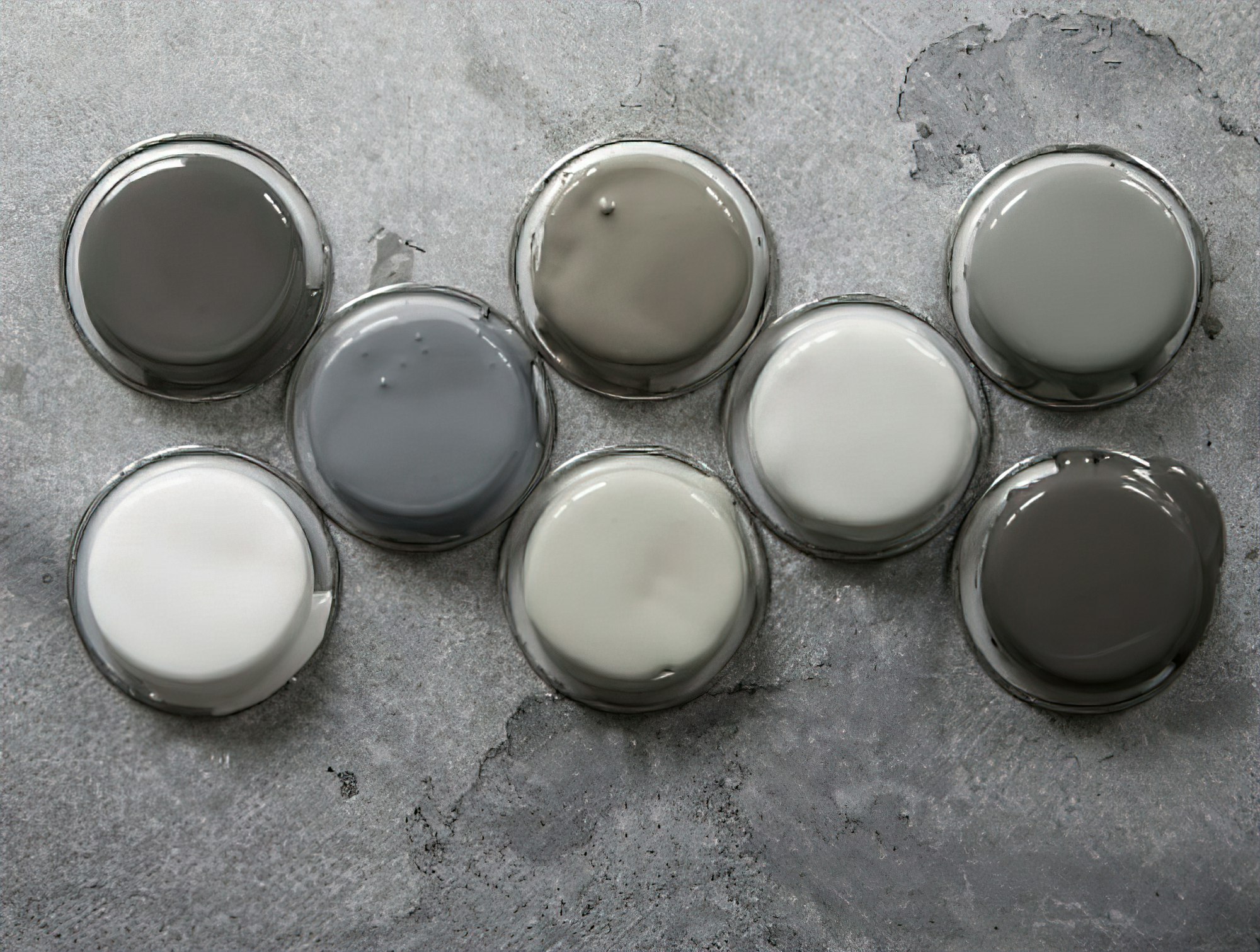
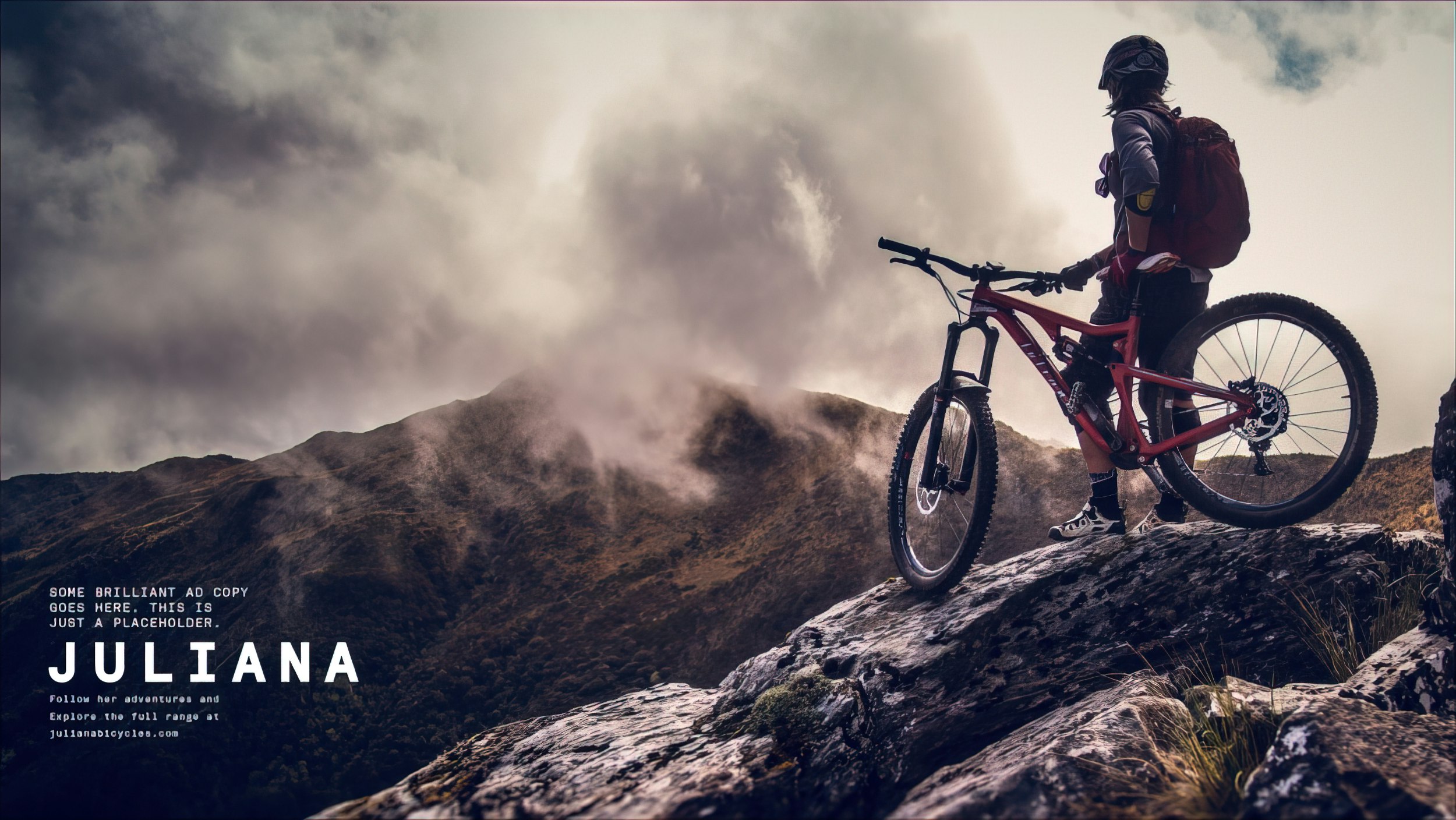
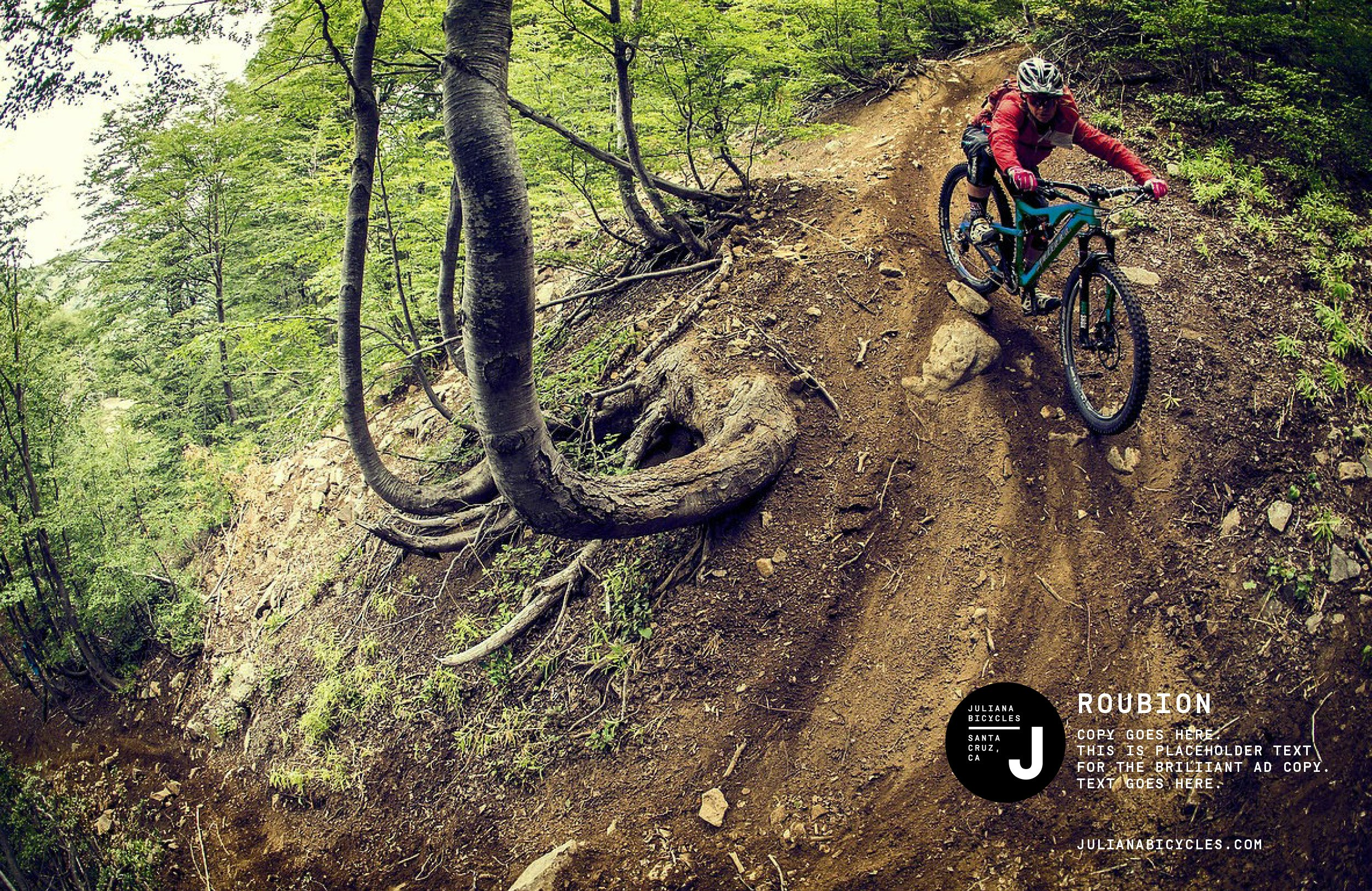
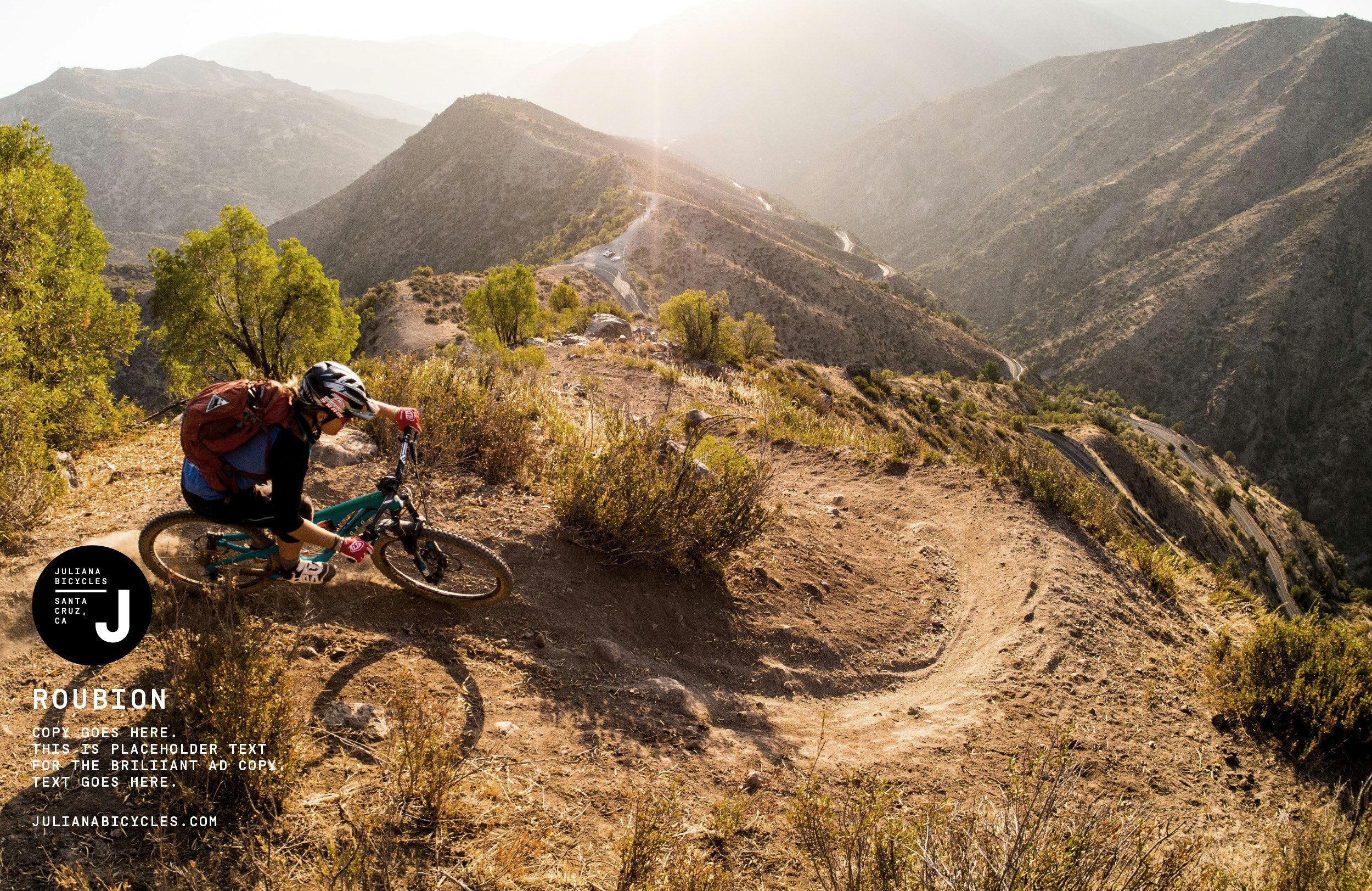
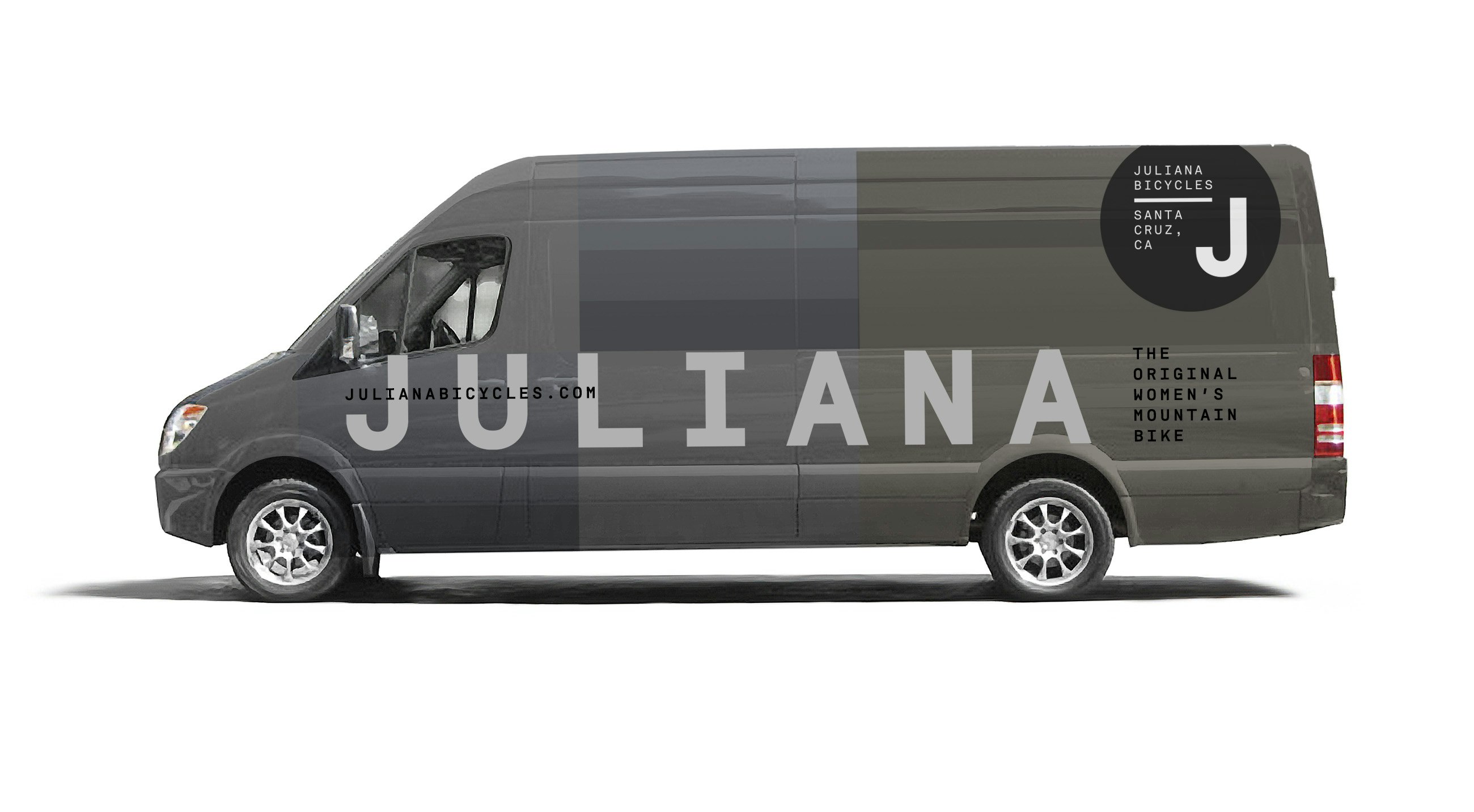
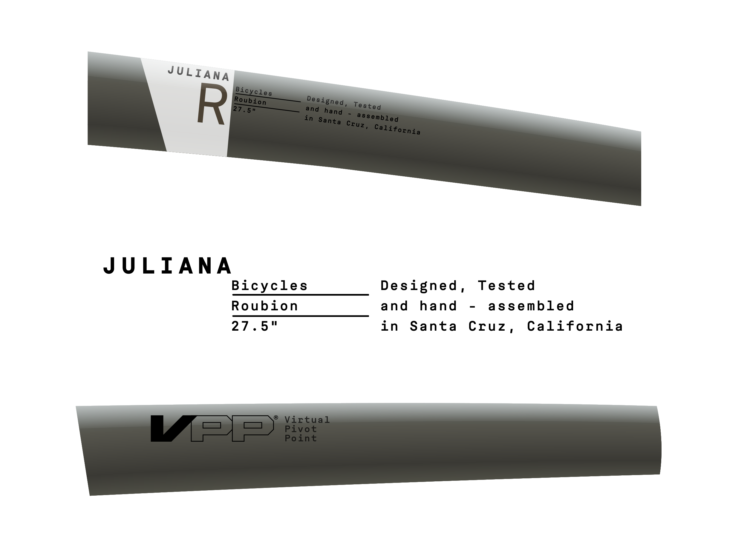
On the Santa Cruz side of things, the guys were "trying things", with loud and obnoxious paint schemes that were super over-the-top (e.g. the aqua/pink Nomad, circa 2014). I thought Juliana's visual identity could be based on earth-tones, so I created a color palette that steered almost 180 degrees from what Santa Cruz was doing. The brand ID leaned heavily on contemporary typography that was designed to reflect a minimalist, no-nonsense aesthetic, but also be highly unique in the bike industry (think Le Labo, but for bikes). Photography included action shots that reflected real riding conditions; dusty and muddy shared space with clean and pristine.