


Bike graphics evolution ≥
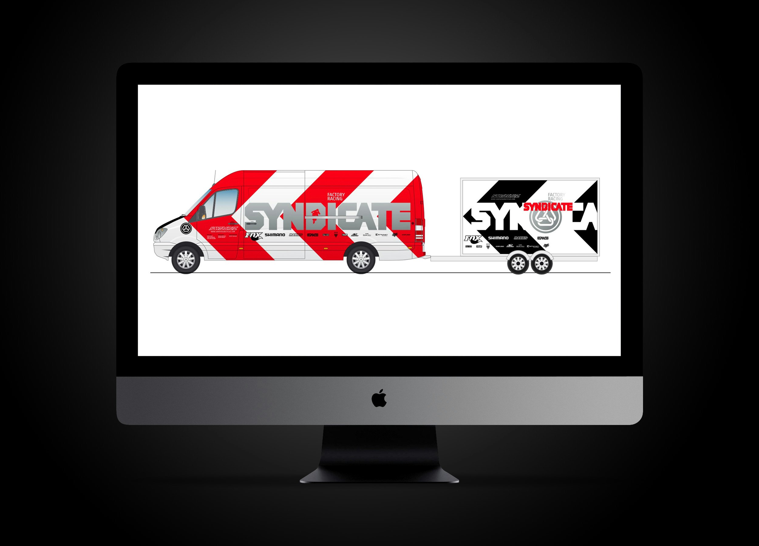
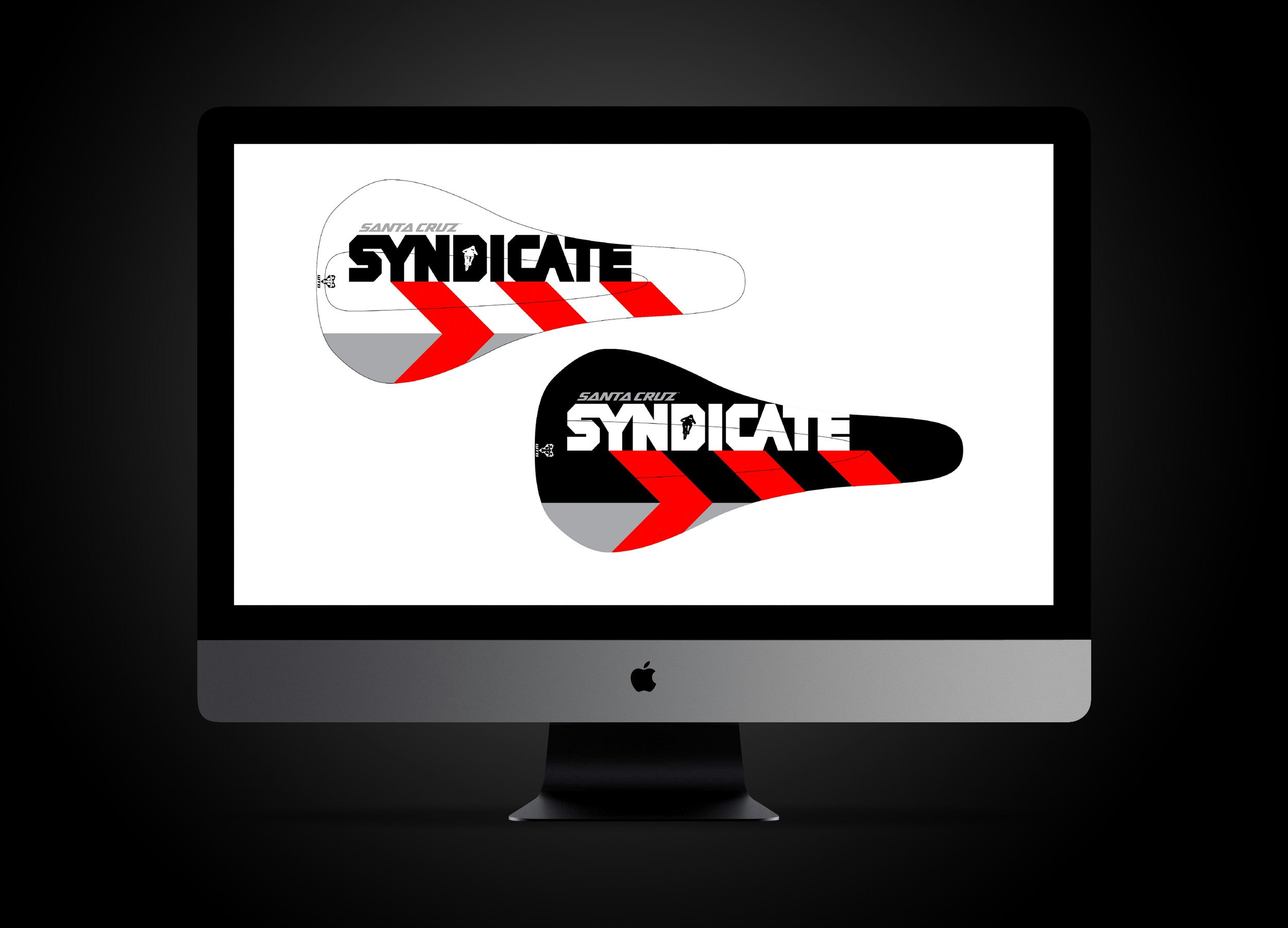
Bike graphics look alike from brand to brand, much the same as any other industry; everyone is swimming in a sea of sameness. During my time as Creative Director at Santa Cruz, I gave a few internal presentations to management, sales, marketing, and engineering to show possible design directions for bike graphics. This one is using a geometric chevron device–which was derived from the original Santa Cruz Bicycles logo from 1994–that would be highly visible and distinctive, differentiating Santa Cruz visually from the pack.